Vandebron Design Language Refresh (WIP)
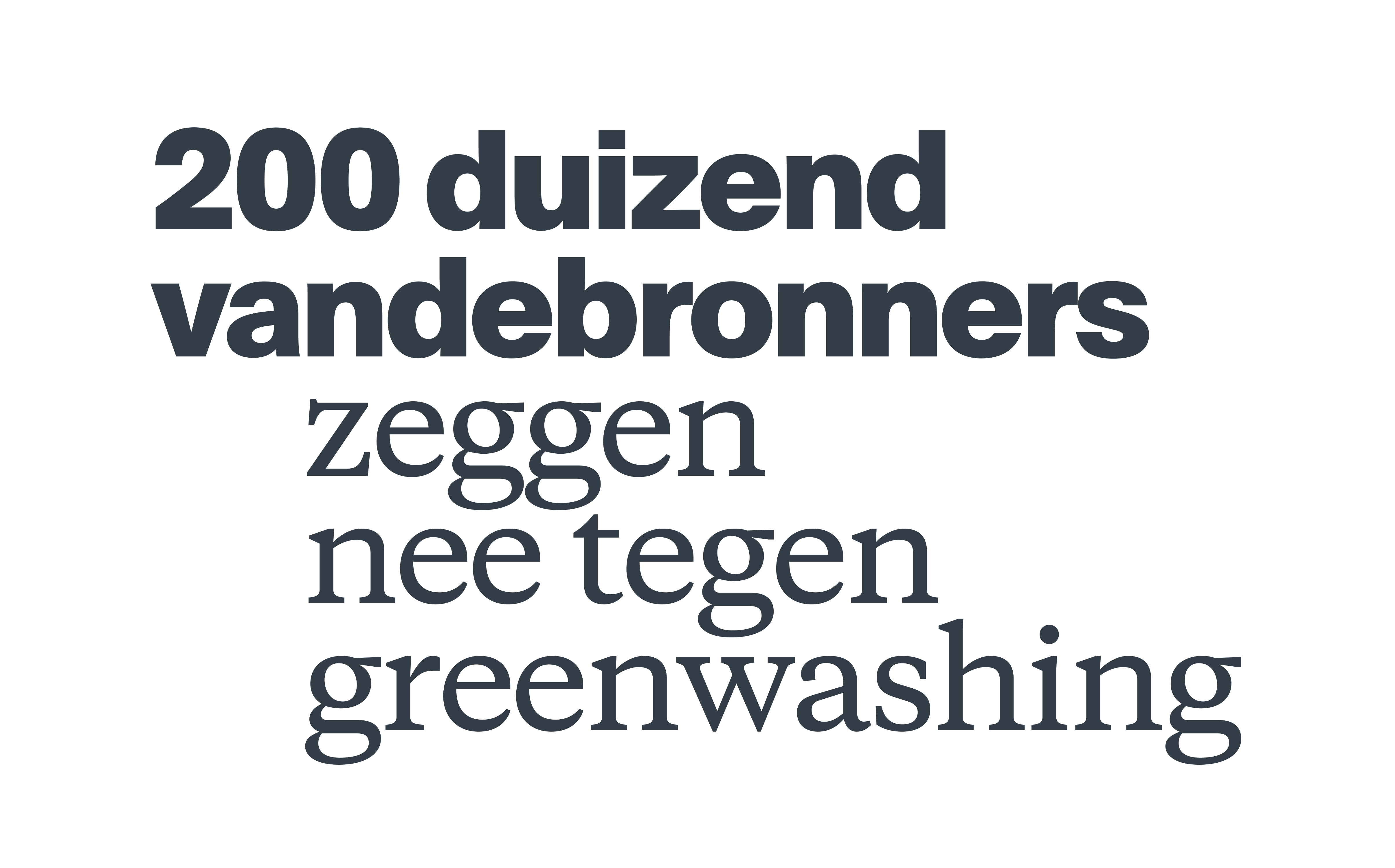
Type treatment by Dawn for the brand campaign
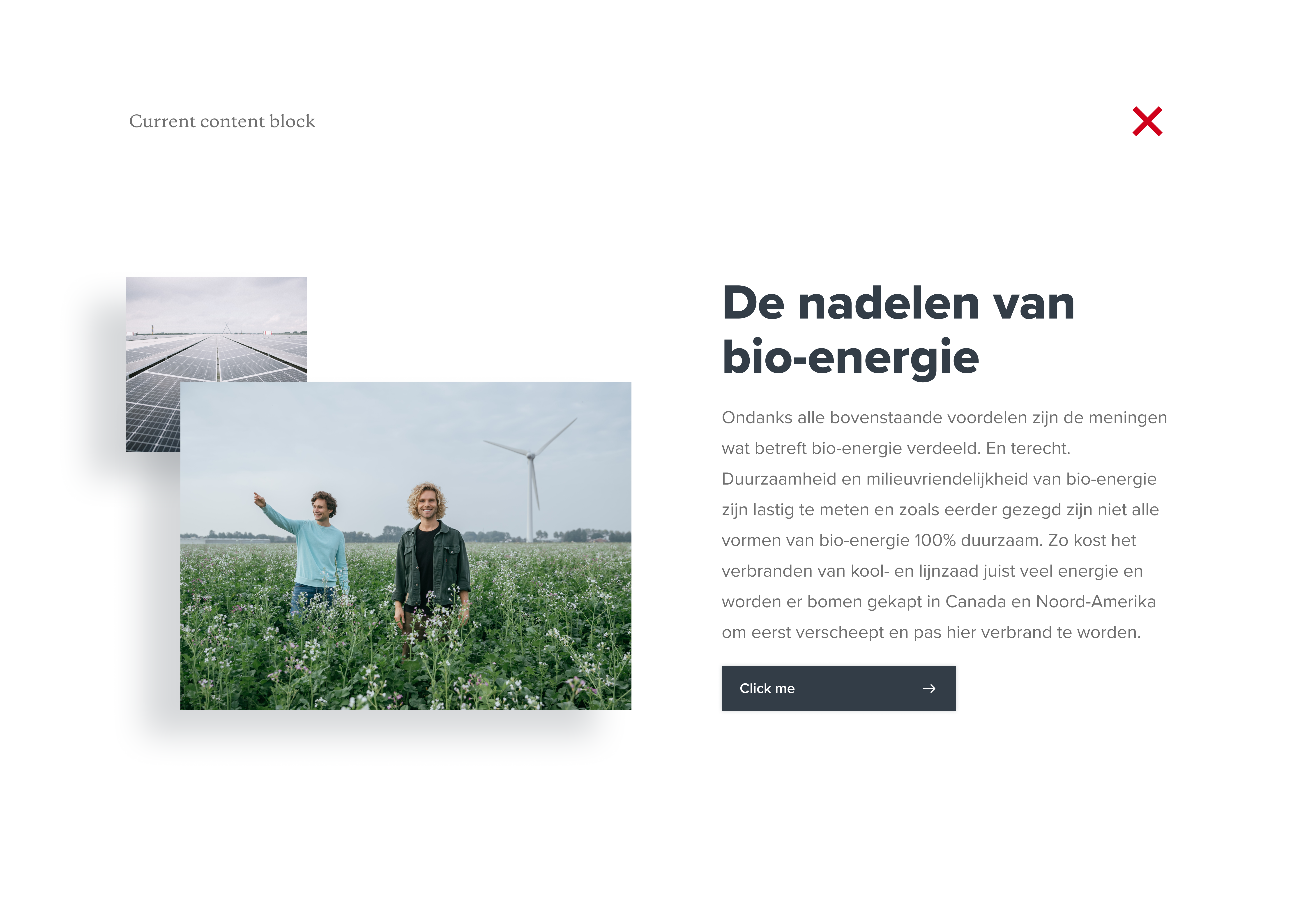
Old type applied to a regular content block
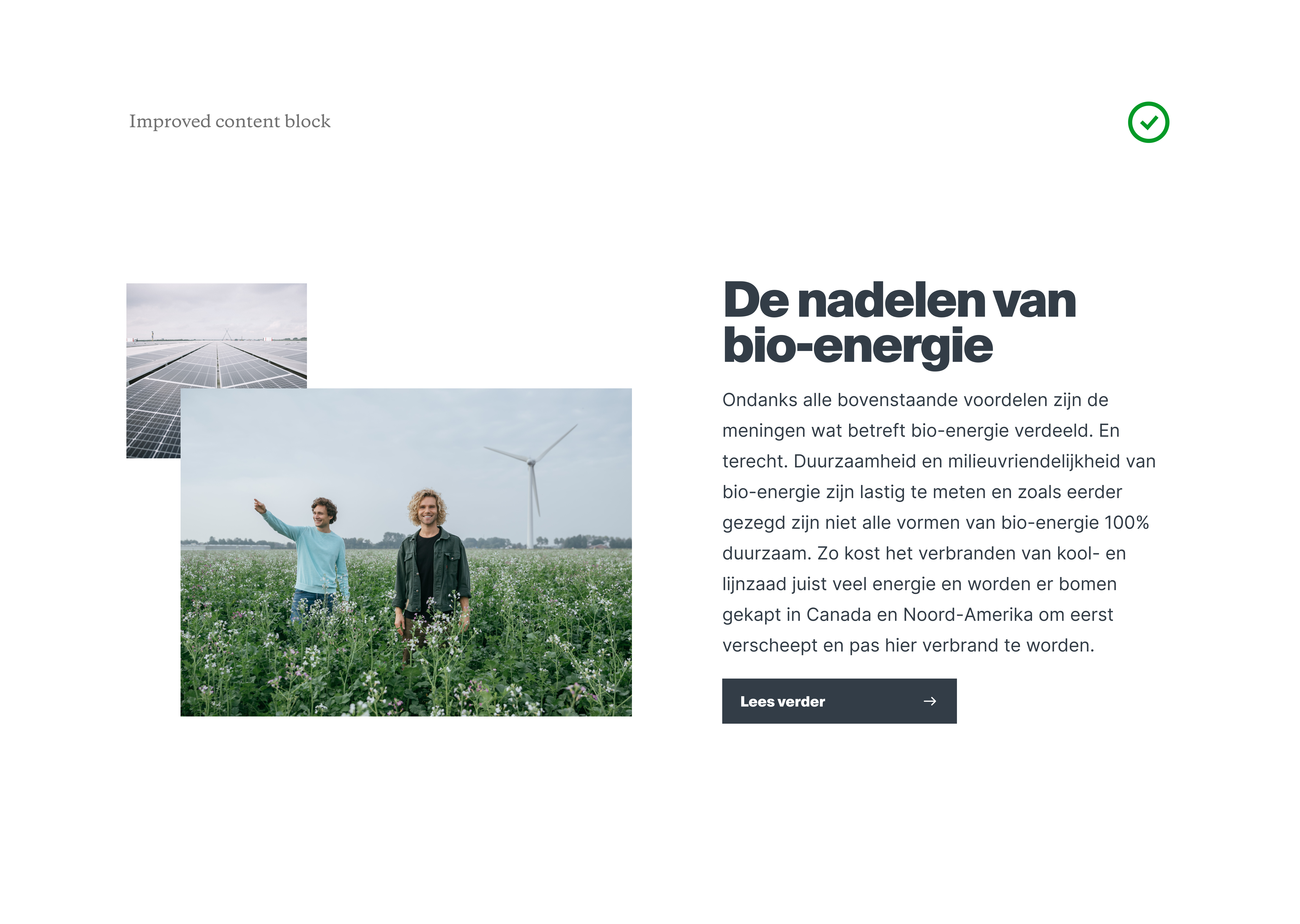 New type, new paragraph color and removal of drop shadows
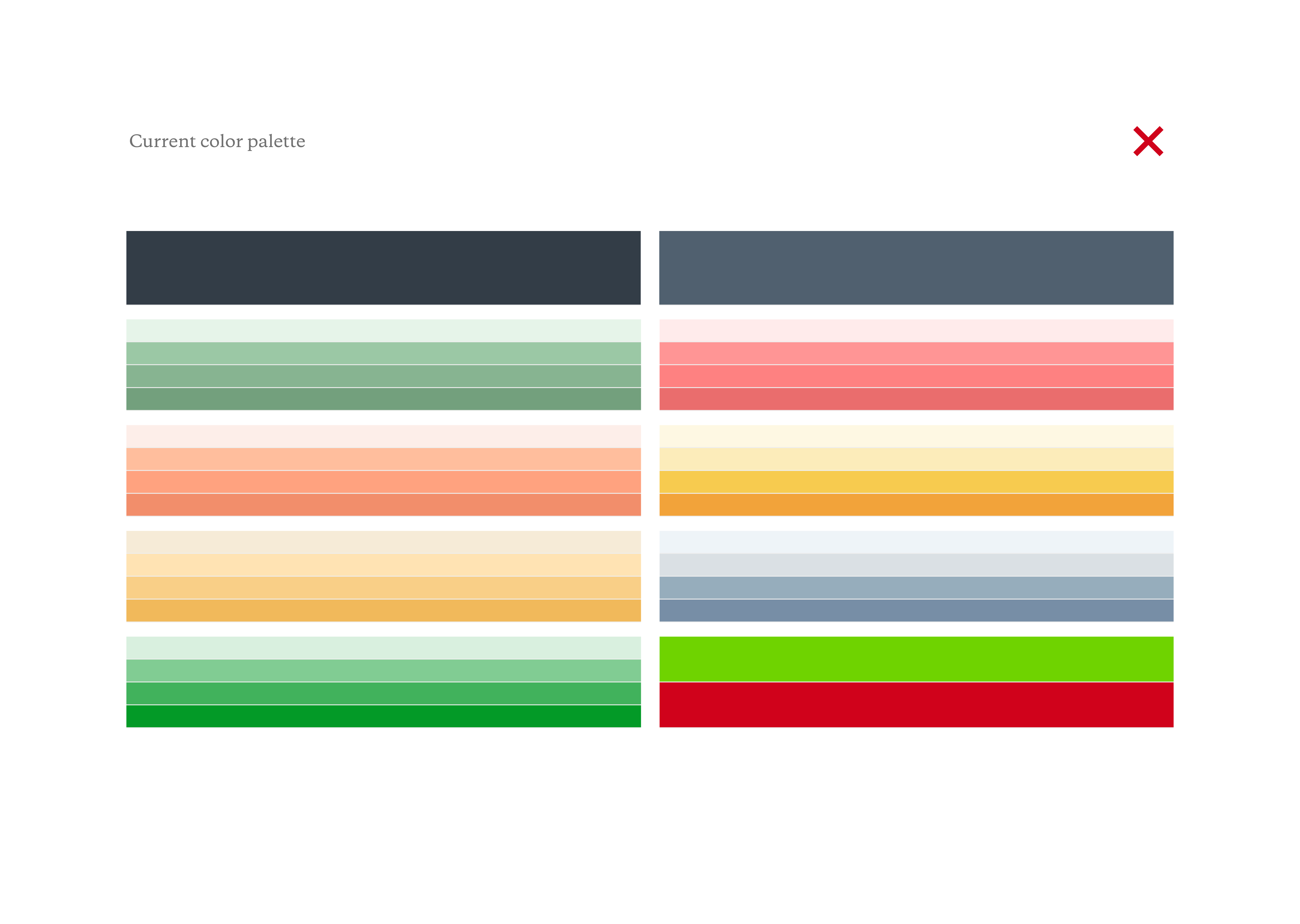
Old color palette. Pale/matte, complex and too many similarities between colors.
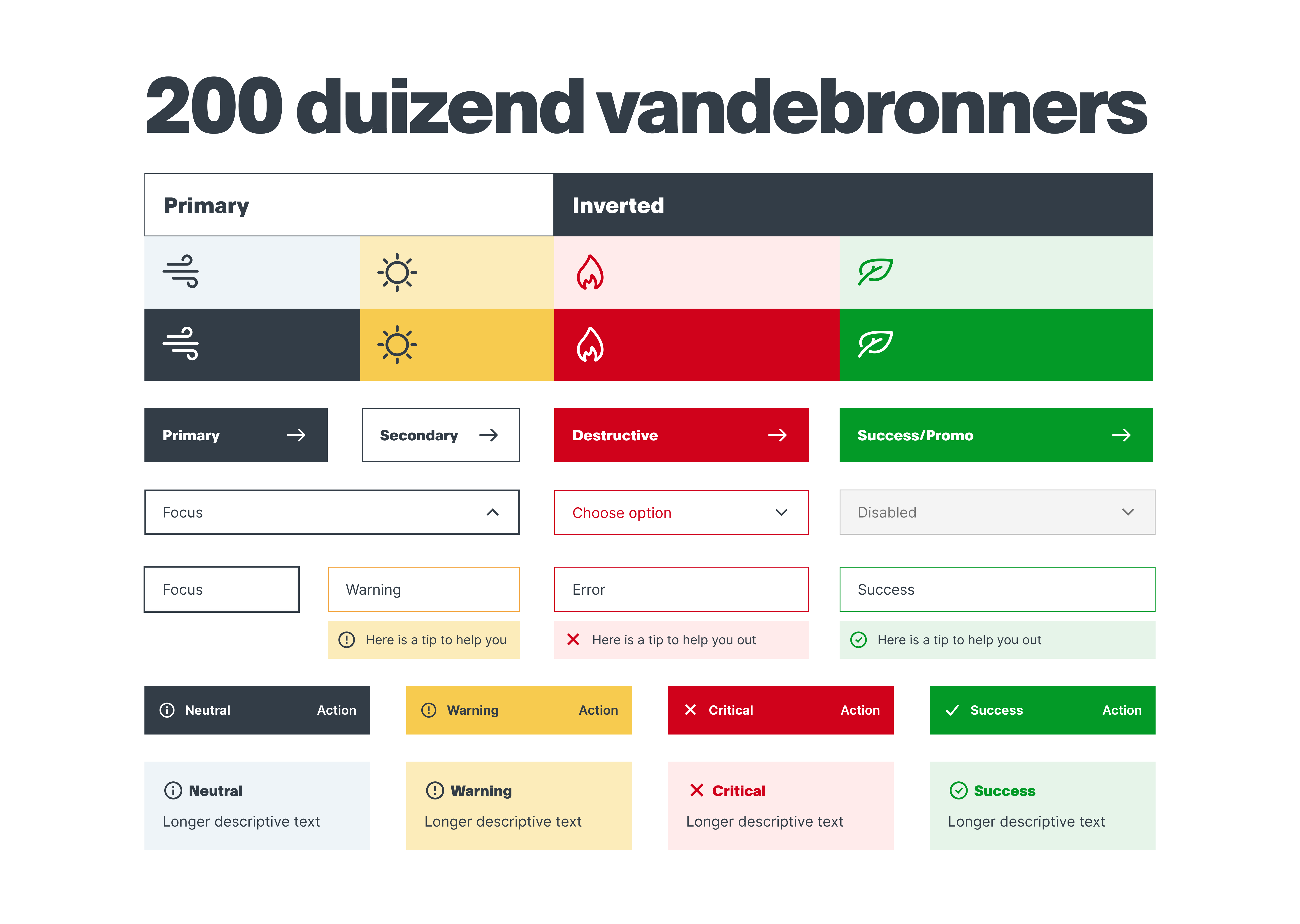
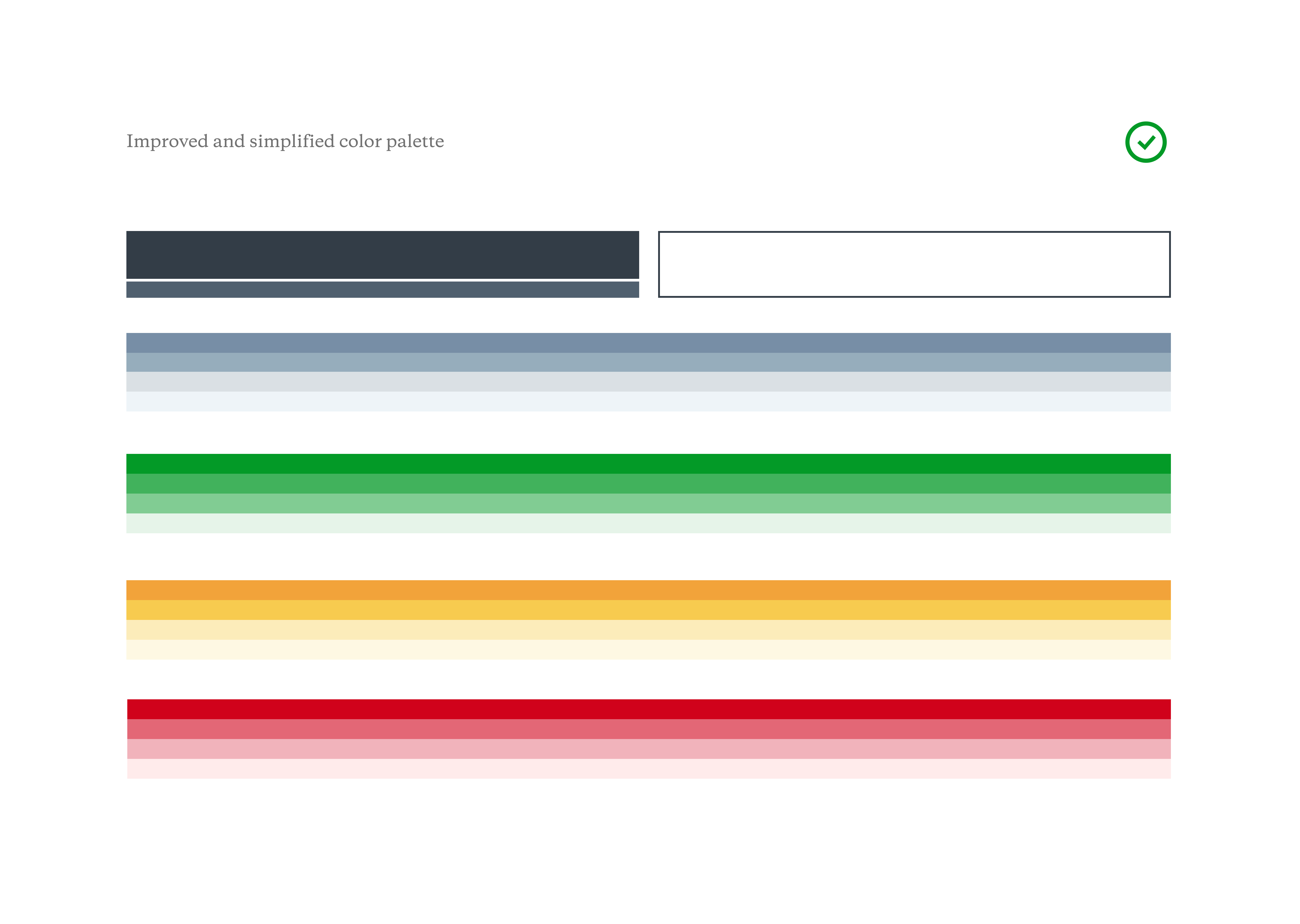 New color palette. More vibrant, simplified and combining similar colors.
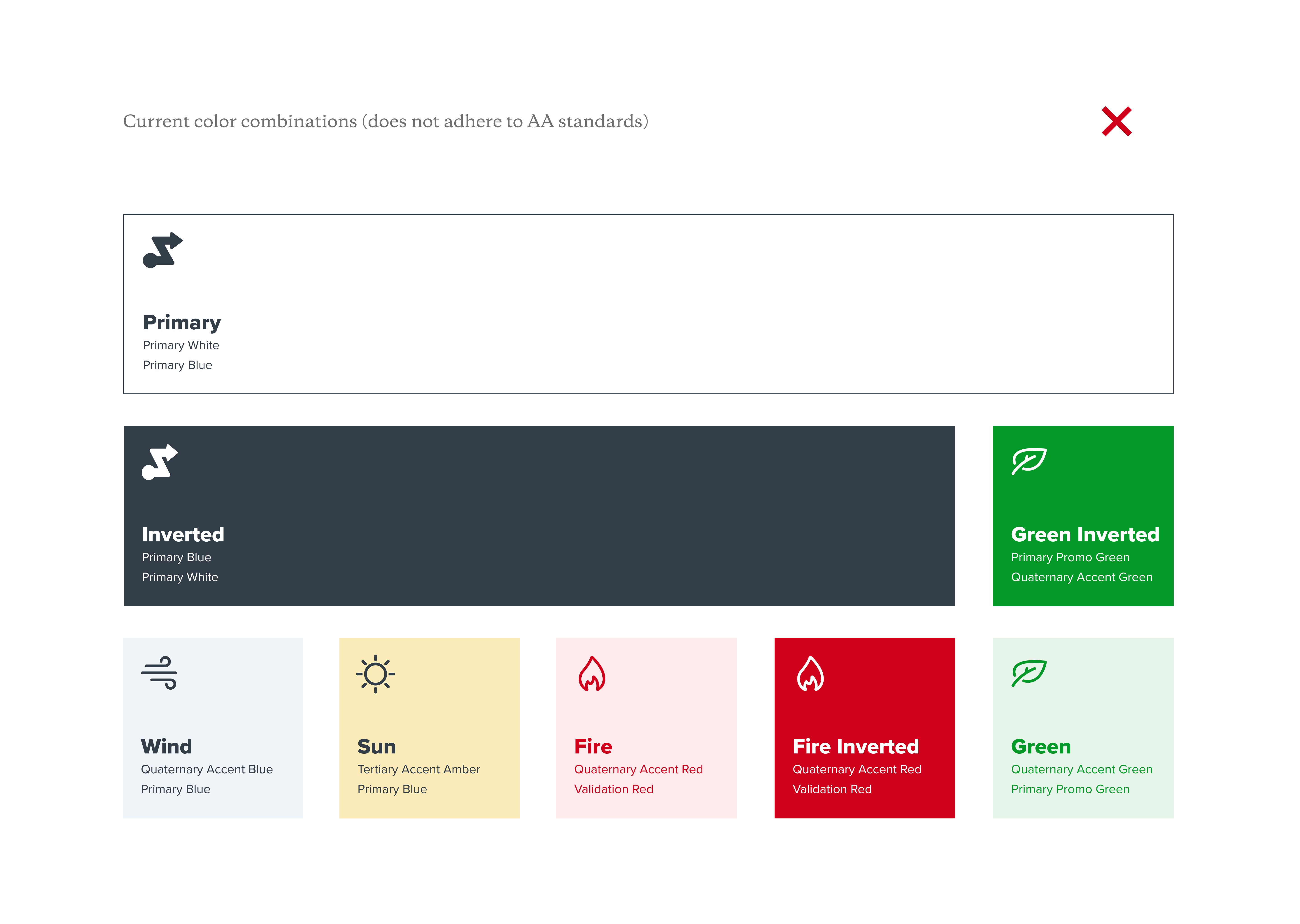
Old color palette combinations. Pale/matte and low contrast that did not pass AA accessibility standards.
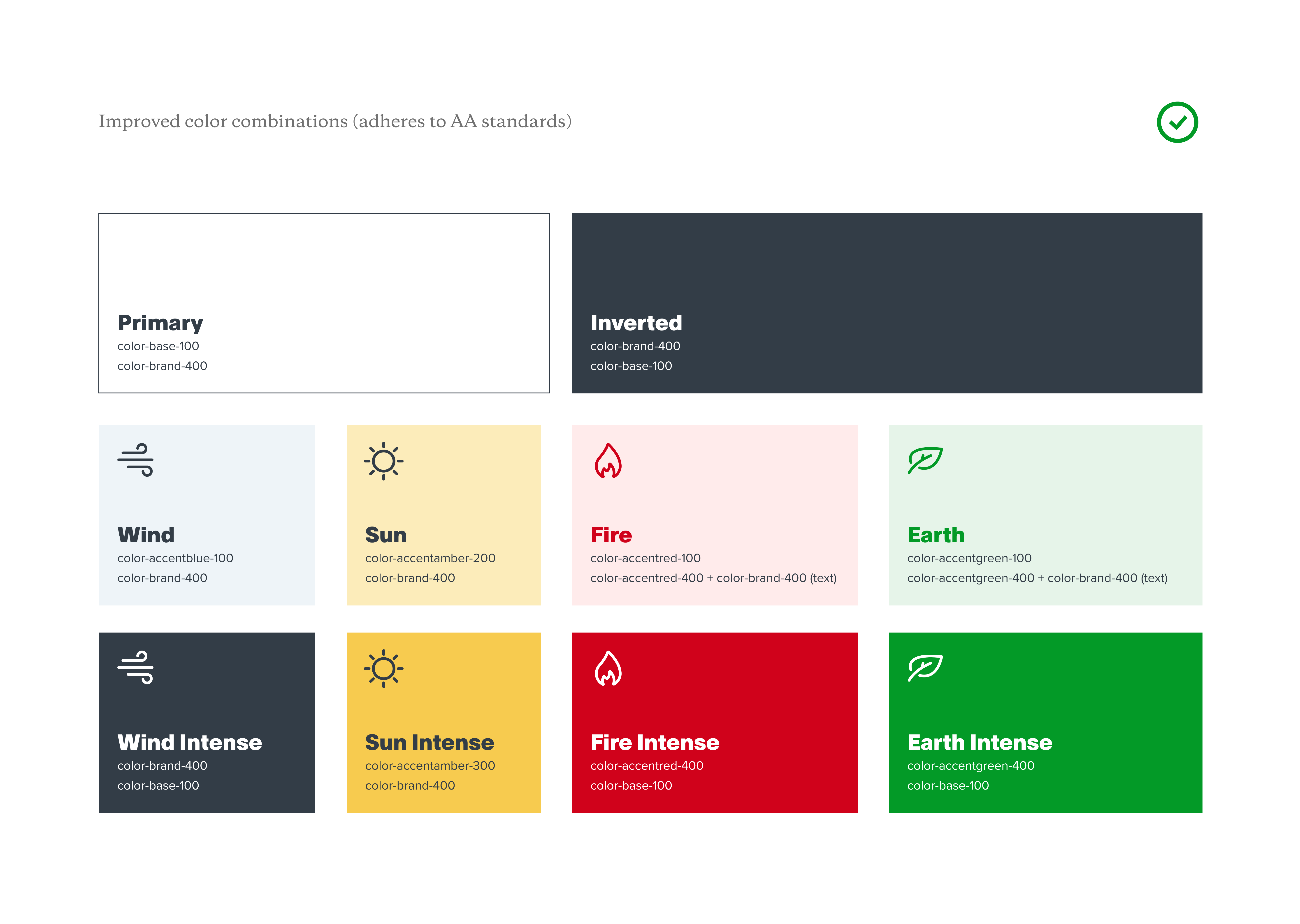
New color palatte combinations. A bit more punchy and higher contrast, passes AA accessibility standards.
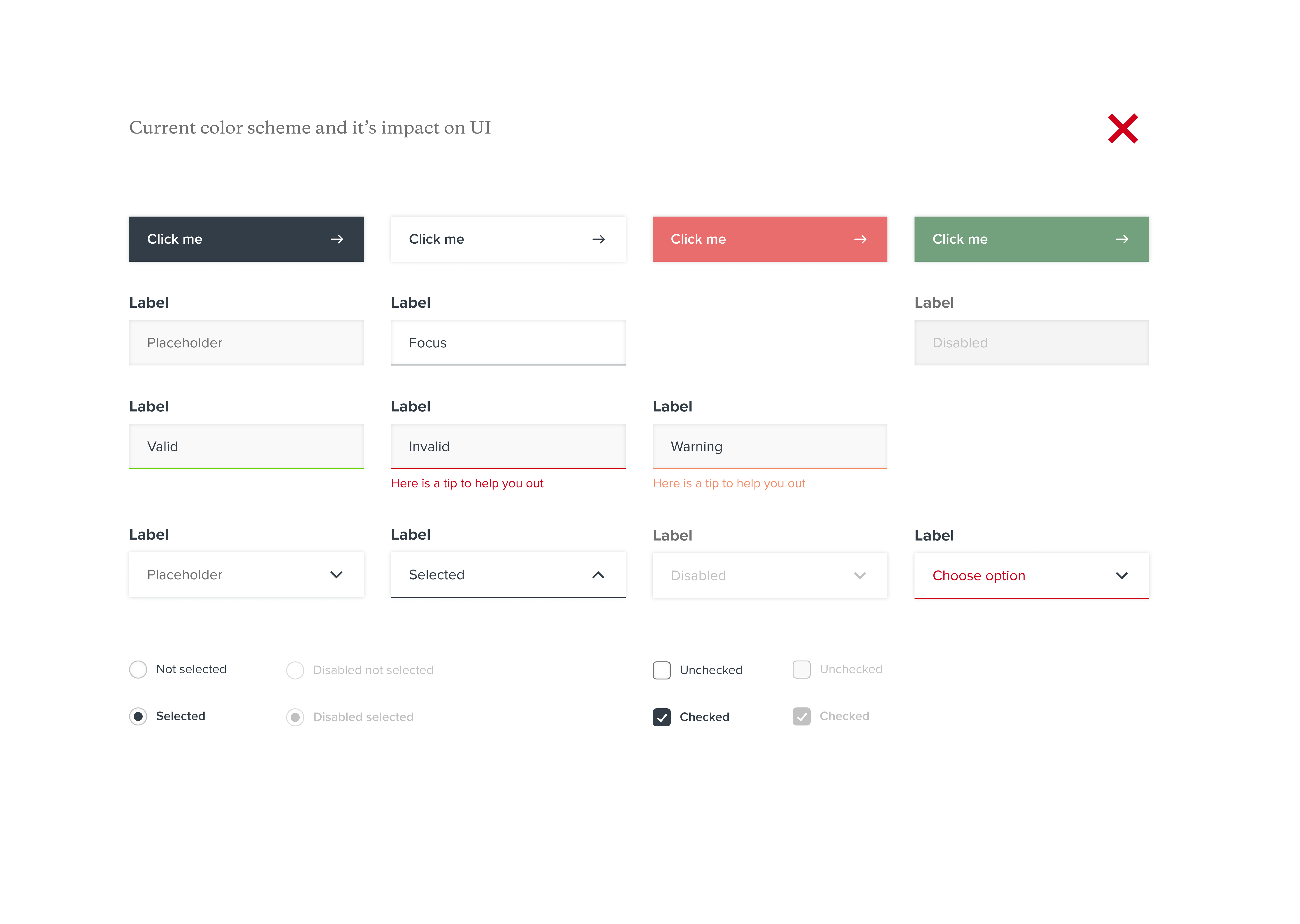
Old color palette and drop shadows impact on UI. Low contrast and hard to distinguish components states. Did not pass accessibility audit (AA).
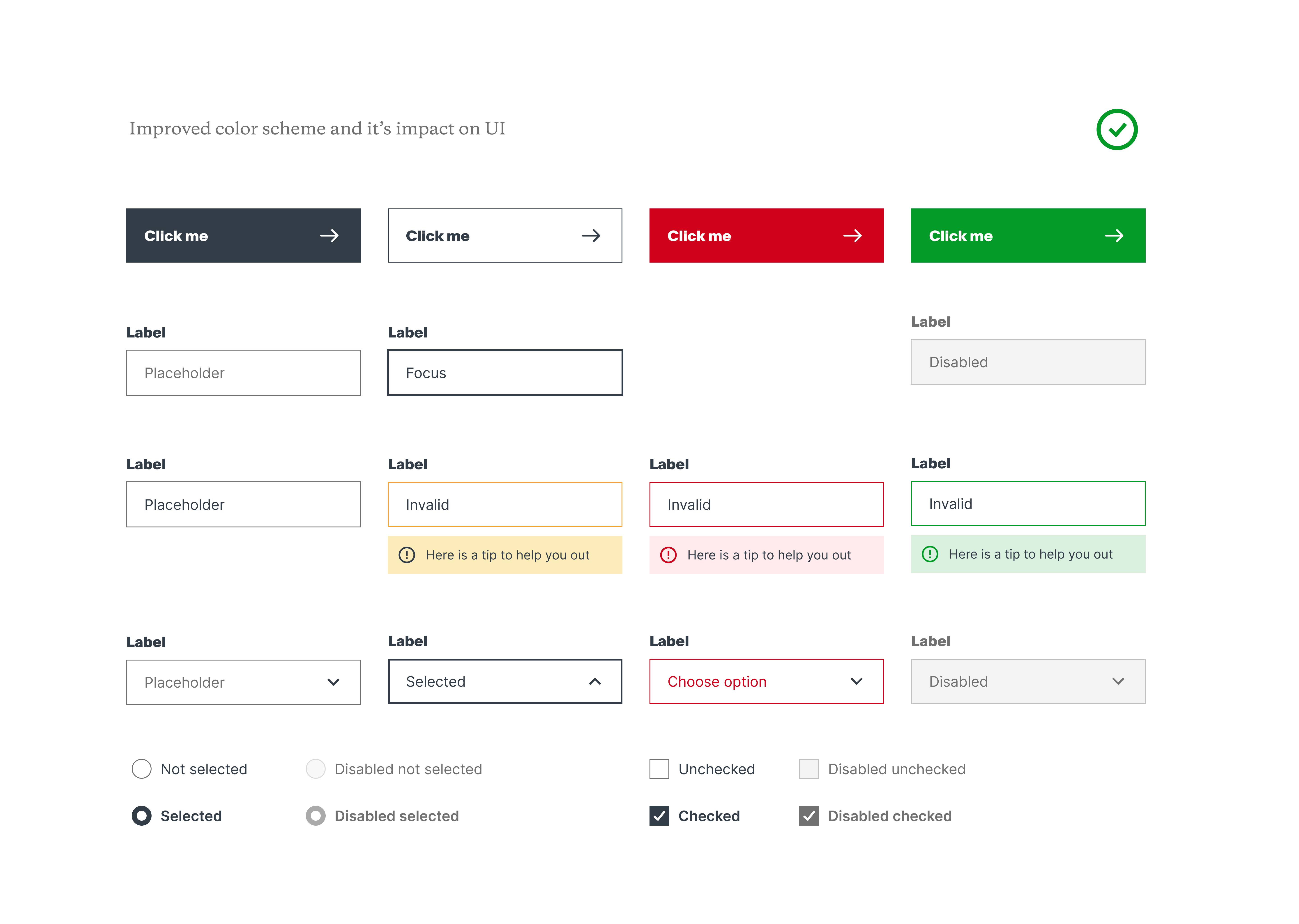
New color palette and outlines(instead of dropshadows) impact on UI. Better contrast and easier to distinguish a components state. Passed accessibility check (AA).
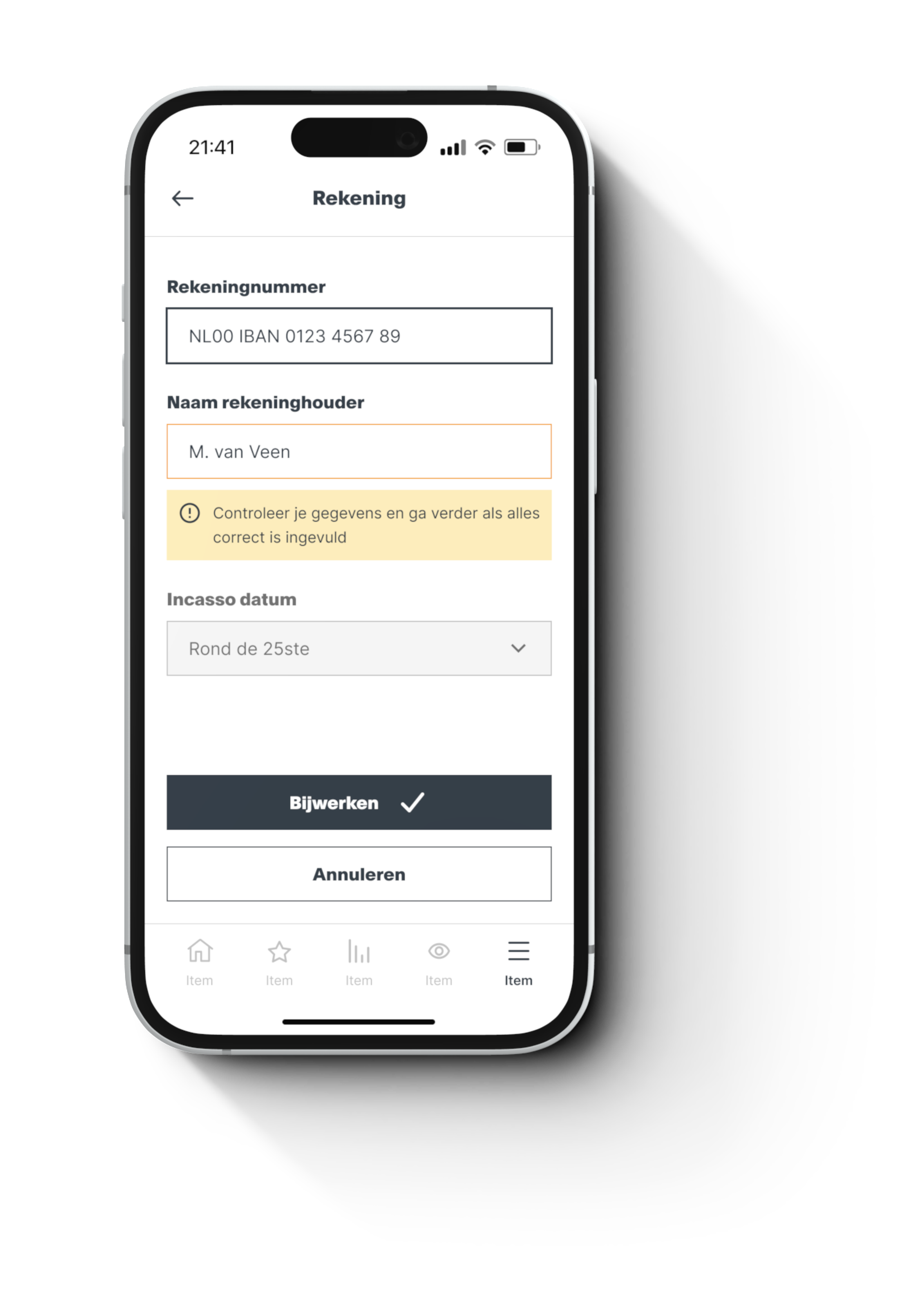
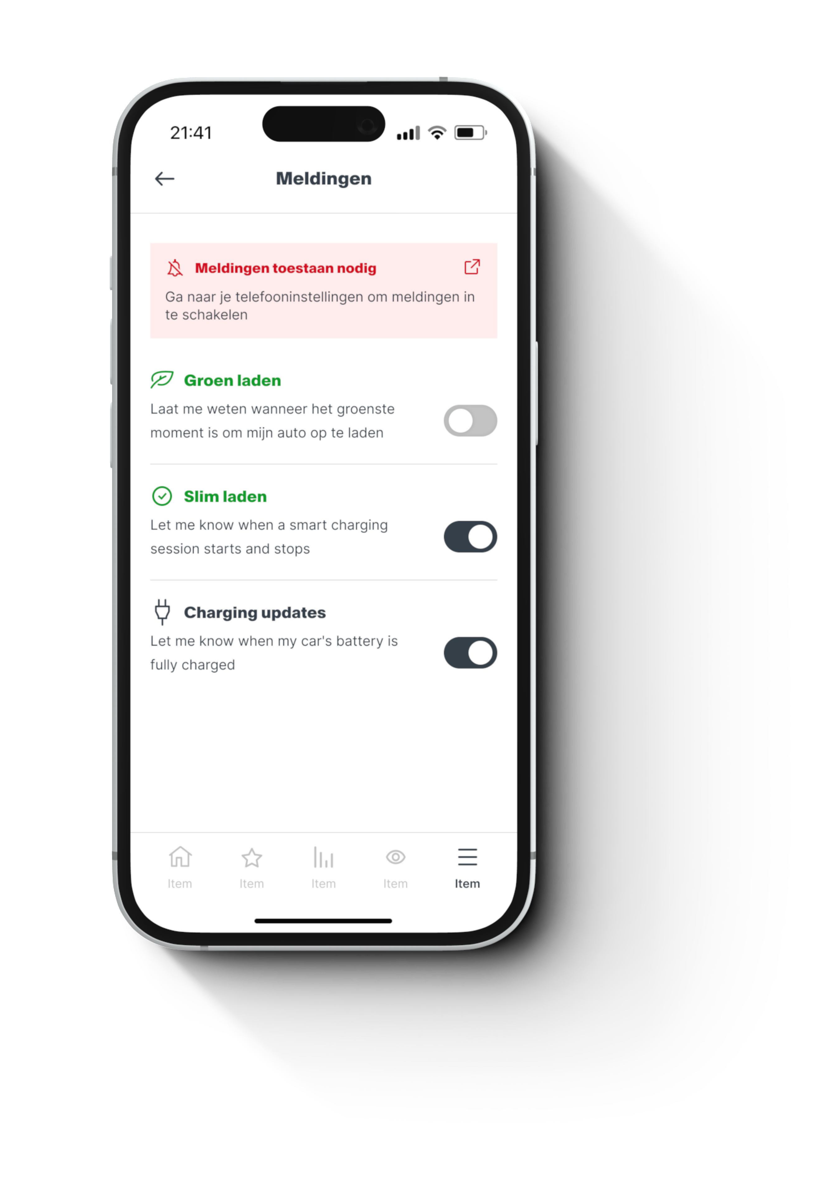
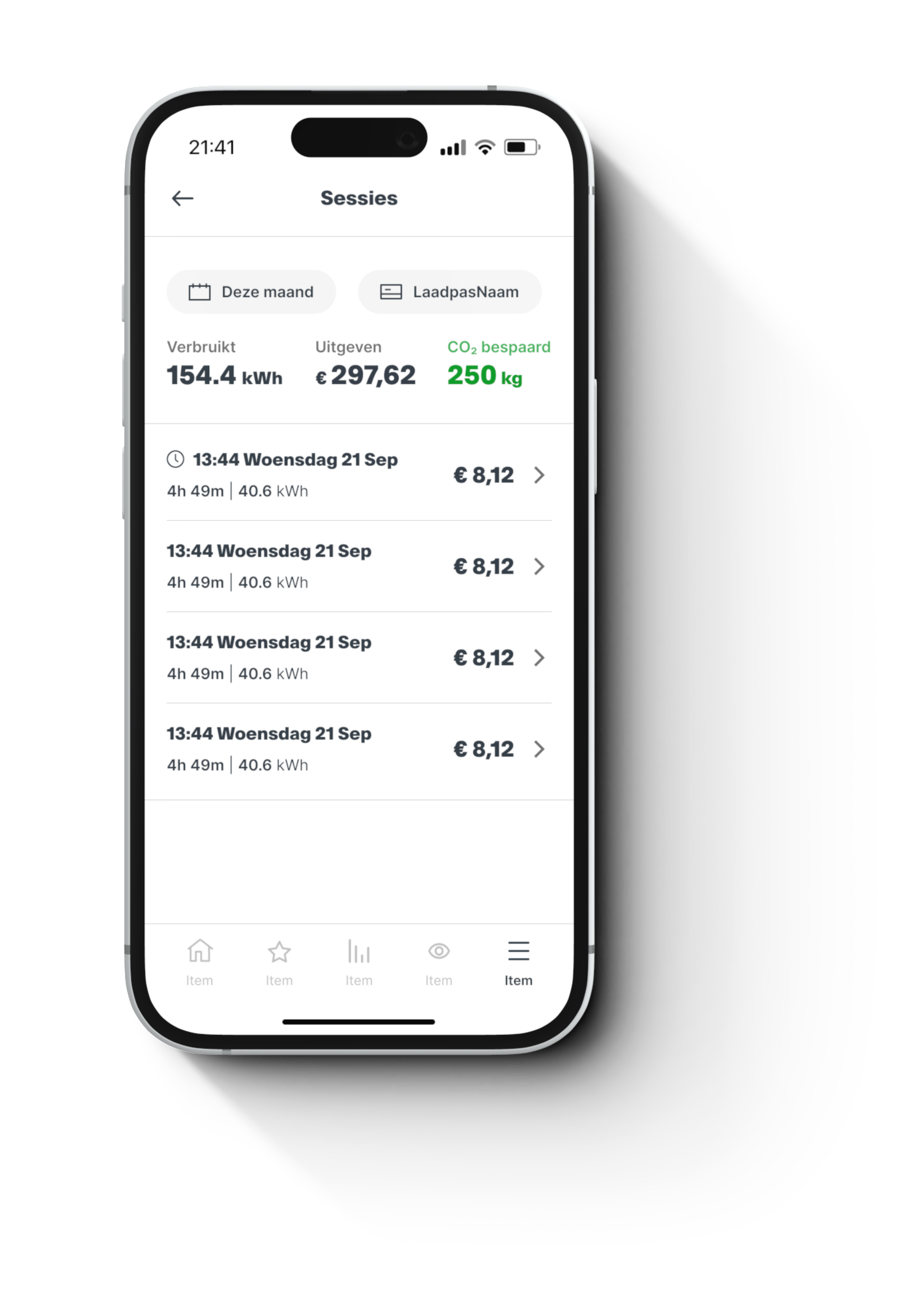
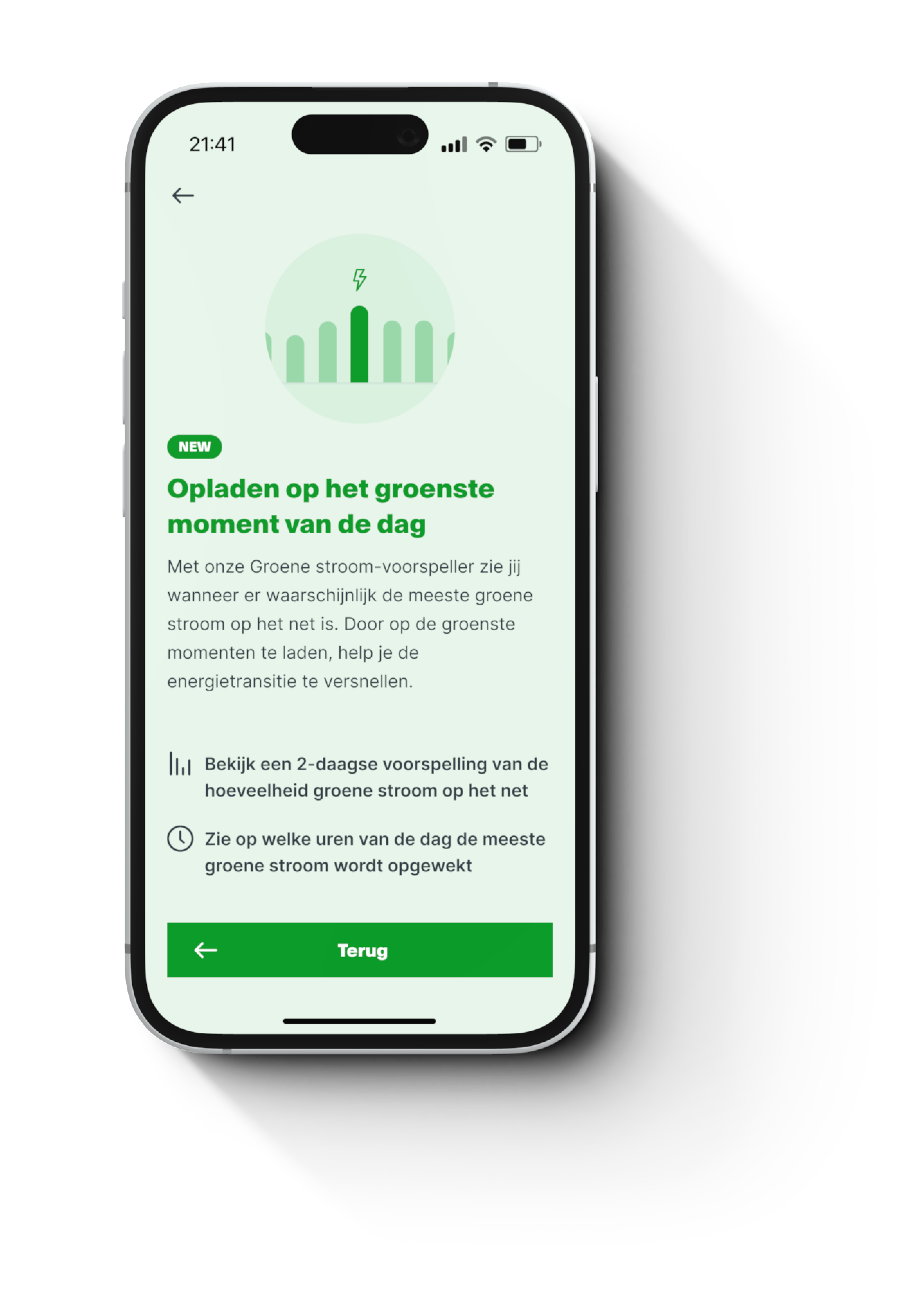
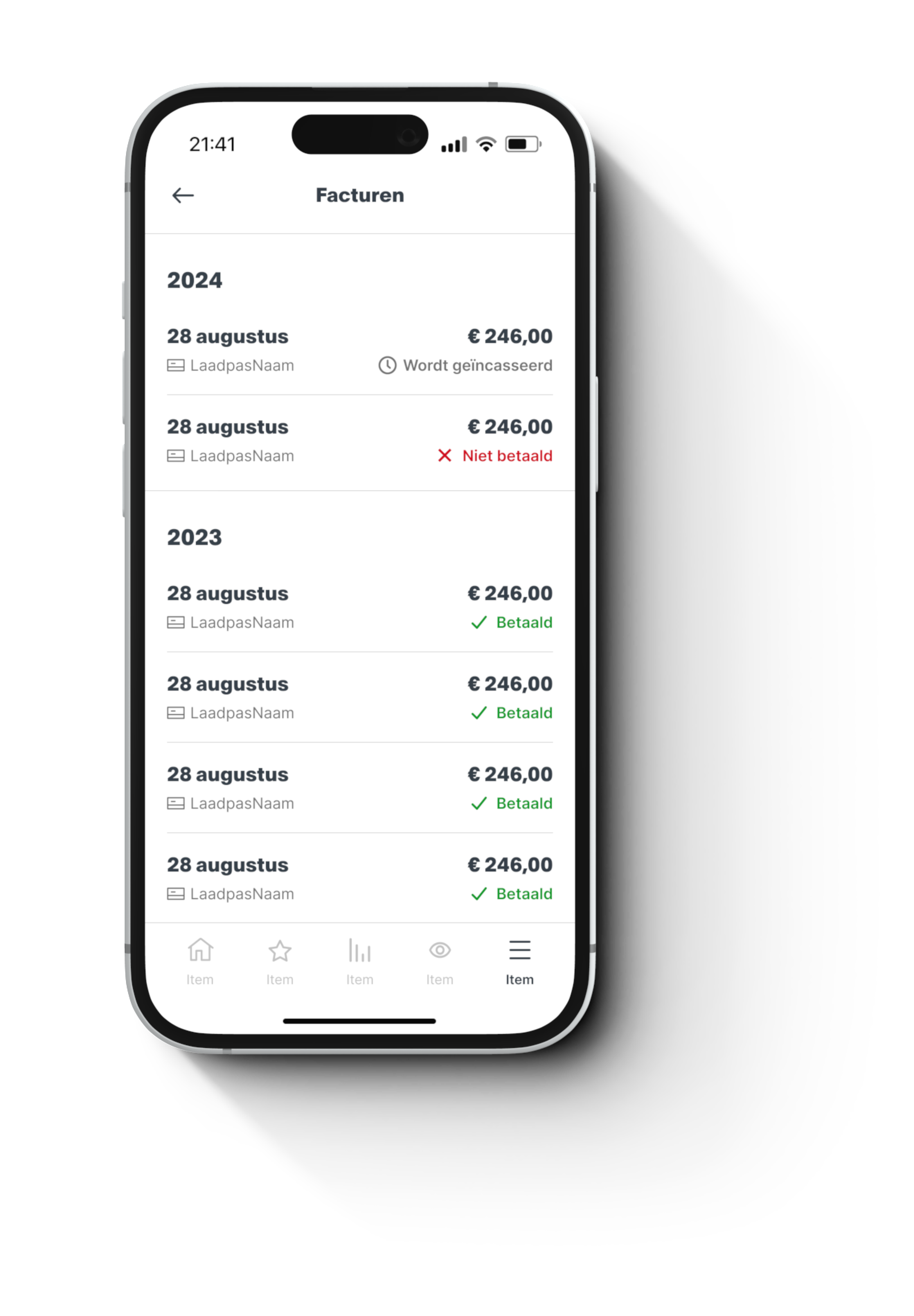
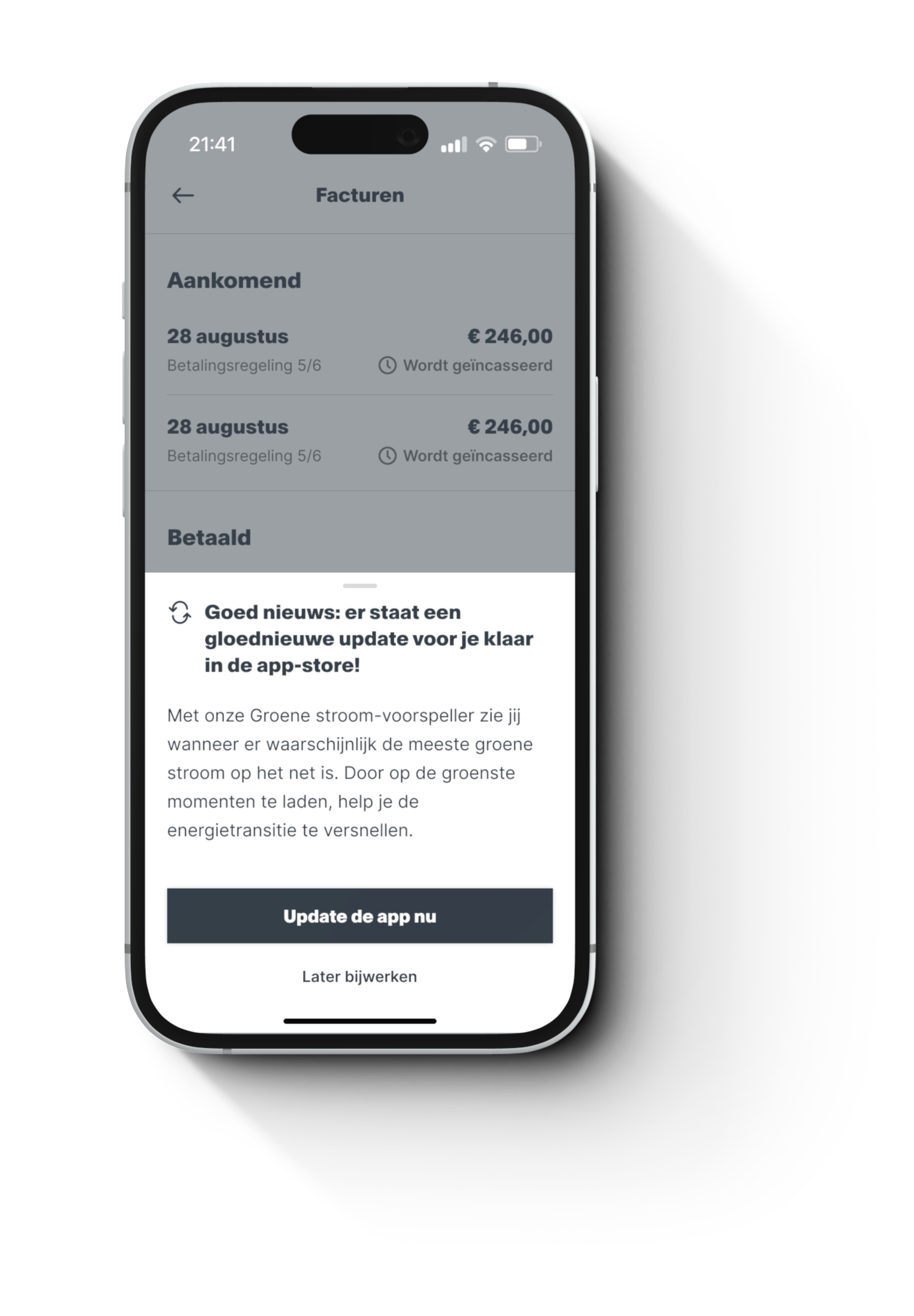
Exploration on the impact of the above fixes in the Vandebron app enviroments (Energy + EV)
